
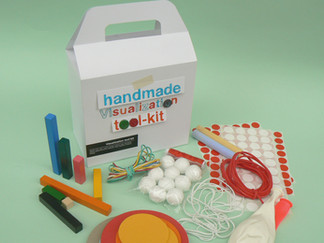
Handmade Visualization Toolkit: A Dataviz kit that has inspired thousands of people all around the world
A Kit That for Over 10 Years Has Inspired a Unique (and Very Latin American) Perspective on Data

In 2008, the world of data visualization had become a field dominated by programming and advanced technology, leaving many people excluded from access to information. Complex visualizations required technical knowledge that was out of reach for most.
In Colombia, where the digital and educational divide runs deep, thousands of people lack access to relevant information simply because they don’t have internet, electricity, or training in digital tools. But we believe that data visualization should not be a privilege.
🧰 Our approach: simplicity and accessibility
The Handmade Visual Toolkit was born from a clear principle: to make data more visible using simple and accessible tools for anyone. You don’t need to be a programmer or have specialized software; all you need is the willingness to represent information in a way that’s easy to understand.
That’s why we created a kit made from everyday materials, available in any home or local store. An approach that remains relevant today—when the amount of data generated in a single day equals what used to take a whole year.


🌍 A Global Impact
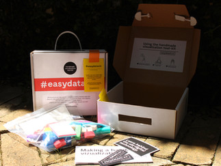
Since its launch, we decided to give away the Handmade Visual Toolkit. The response was unbelievable: we received over 1,000 requests from all over the world. We distributed as many kits as we could and, in many cases, sent instructions so people could build their own.
Today, we’ve held hundreds of workshops across Latin America and Europe, working with public institutions, NGOs, and media organizations to spread the spirit of data visualization: making information more accessible to more people.


🔄 5 Versions and Counting
The kit has come a long way, constantly evolving through workshop outcomes and valuable feedback. We’re always looking to improve the user experience and the way data is presented:
Version 1 (2009): A commercial box, handwritten labels, and a simple design.


Version 2 (2014): A transport-friendly system was added, along with printed instructions.


Version 3 (2016): A compact design, ideal for international travel and adapted for longer materials.


Version 4 (2019): A return to the box format, now incorporating the colors of our visual identity.


Version 5 (2022): A more refined and integrated design, featuring distinctive graphics and visual elements that represent us.


🎨 Workshop Outcomes
These are some of the results from our data visualization workshops using the Handmade Visual Toolkit.Participants are often deeply moved when, after a short introduction, they get to bring one of their own data points to life—using very simple materials, in spaces that are part of their daily lives.


🧑🔧Inspiring Others to Create Their Own Version
As we received so many requests for the kit, we realized that distance and logistical challenges shouldn’t be a barrier.
That’s why we developed open instructions so that anyone can build their own kit at home, using local materials.


📚A Globally Recognized Kit
The Handmade Visual Toolkit has been featured in books, media, and academic spaces around the world.
This confirms that our goal has been achieved: making data more visible, in any form possible.

1) Visual Storytelling: INspiring a new Visual lenguaje, 2011 2) Infographics: Designing and visualizing data, 2014 3) Making with data: Physical design and craft in data driven world, 2022 4) Community Data: creative approaches to empowering people with information, 2024

🧩 Data That Sparks Conversations
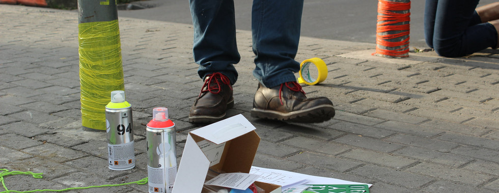
The spirit of the kit has inspired organizations like We Count and Telraam, who work to empower citizens through urban mobility monitoring.
With sensors installed in household windows, so-called citizen scientists collect data on traffic and pollution.However, a key challenge emerged:How can this data be shared within local communities that don’t necessarily use digital tools?
The Answer:
Adapt the Handmade Visual Toolkit by creating a version called “Let’s Play with Data.”
This version responded to specific spatial needs, using lamp posts and neighborhood street spaces to make data visible and spark conversations among neighbors.


"If MacGyver were a Dataviz nerd, he'd loved this"
John Pavlus, FastCompany
Nuestro Alcance
36
Cities
2660
Kits Delivered
+5000
Workshop Attendees


